BLIDFORS COACHING
A Website for a Relationship Coach for Men
1. Overview
Project description
This freelance project was carried out for Blidfors Coaching, a business led by Niklas Blidfors, a relationship coach specializing in coaching men. Niklas needed a website to establish his online presence, strengthen his brand, and create an easy way for clients to book coaching sessions. Before the project, his online presence was limited to social media, and he lacked a cohesive brand or professional platform.
Role
UX/UI design
Tools
Figma, Squarespace, Procreate, GIMP (photo editing software)
Project type
Freelance project
02. Research
Understanding client needs and vision: interview & questionnaire
I began the project with an initial meeting with Niklas to understand his business vision and website goals. To dive deeper into his preferences and brand identity, I created a Google Form covering key topics like branding, design preferences, functionality, target audience, and competitors. After reviewing his responses, I held a follow-up meeting to clarify any gaps and ensure alignment with his expectations. This collaborative process helped shape the design direction to reflect his vision.
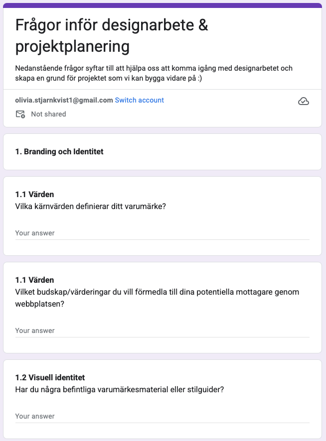
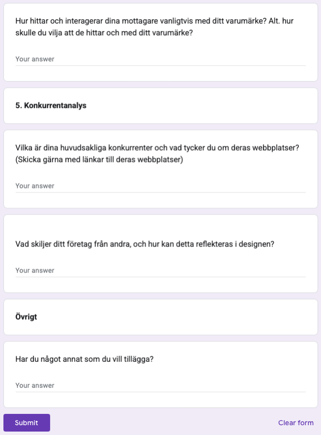
Questionnaire for client covering key topics like branding, design preferences, functionality, target audience, and competitors.
What is the industry standard? - Collecting insights and inspiration through competitor Analysis
To understand design trends and content structures in the coaching industry, I conducted an extensive visual exploration of competitor websites. I captured and organized screenshots in Figma, which became a living reference throughout the design process. This iterative approach allowed me to identify effective design elements, such as clear calls-to-action, trust-building visuals, and intuitive navigation patterns. By frequently revisiting these references, I ensured that the Blidfors Coaching website struck a balance between uniqueness and best practices.
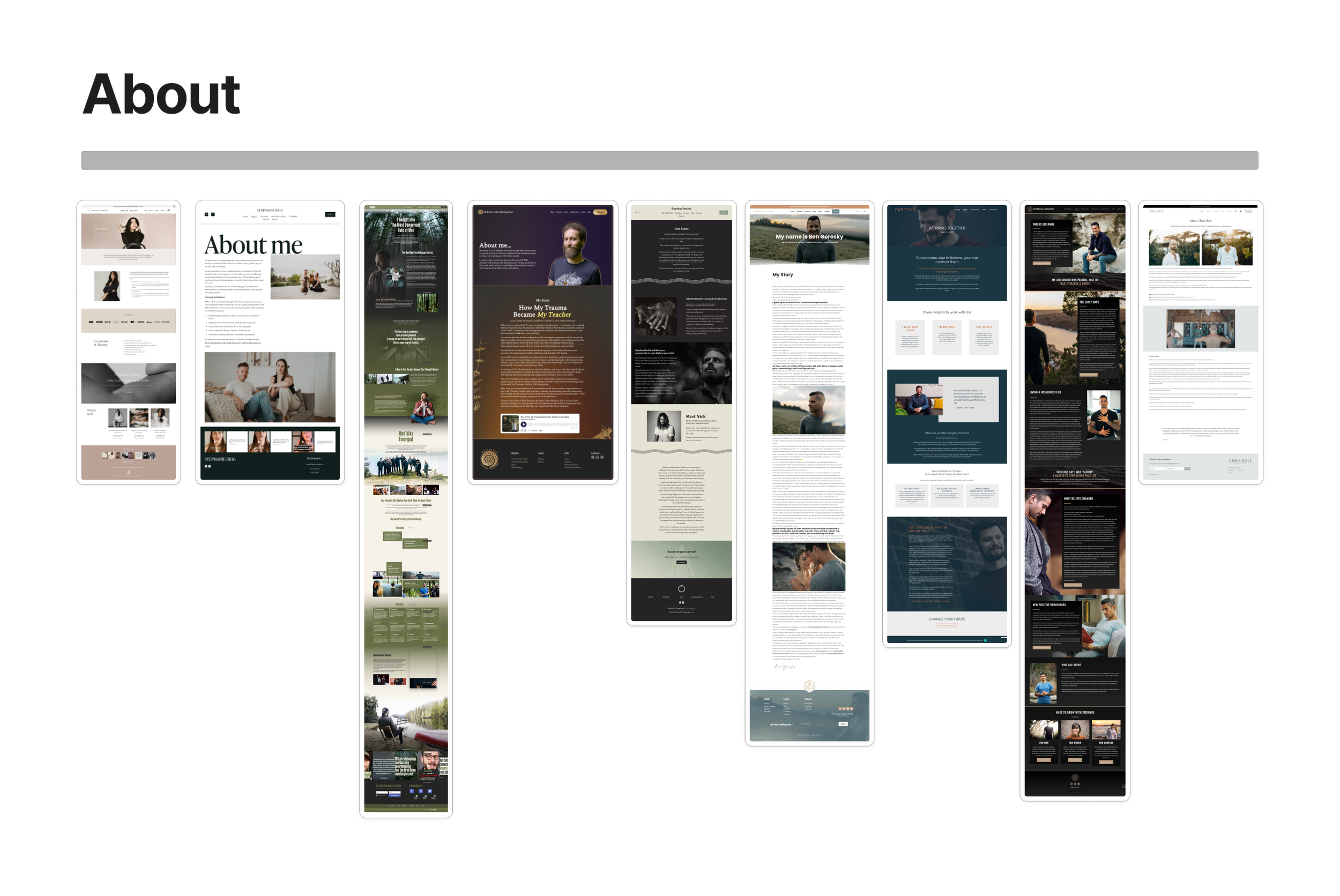
Screenshots of different “About me” pages from competitors.
Client insights
💡Branding & Identity:
Core values: Vulnerability, discipline, self-leadership, and care.
Desired message: Taking responsibility for one's life and being open to facing fears to live a richer life.
💡Design Preferences:
Natural themes and strong, masculine tones without feeling cold or impersonal.
Avoid "too corporate" or overly polished looks and sites that are too soft or generic.
💡Functionality Requirements:
Must present coaching services and blog content.
Include a seamless booking system and options for newsletter sign-ups and social media integration.
💡Target Audience:
Men aged 25-45, typically with desk jobs, middle-class backgrounds, and potentially with partners and children.
Skeptical of traditional masculine coaching but still struggling with vulnerability and emotional connection. Interested in both creative and outdoor hobbies.
Competitor analysis
💡Common Pages:
Most coaching sites feature an About page, Coaching/Services, a Blog, and Contact page.
💡Trust & Credibility:
Competitors prominently use reviews and testimonials to build trust.
💡Design Trends:
Dark, masculine themes were common, which may not align with Niklas's softer, approachable coaching style.
💡Social Media & Engagement:
Social media links and Instagram snippets are frequently used for user engagement and brand visibility.
💡CTAs & Conversion:
Prominent calls to action guide users toward booking consultations or engaging with services.
💡Visual Focus:
Competitor sites use high-quality images of the coach to create emotional connection and trust. Niklas can leverage this for authenticity.
03. Design
Content & Site Structure Planning
I used Google Docs to plan the site structure and content plan, allowing me to collaborate easily with Niklas. The document was structured with clear headings for each section (e.g., home page), and I outlined key elements like the hero image, copy, and CTA buttons.
Niklas could then add copy under each section, comment, and suggest edits, ensuring the website reflected his brand voice and values. This collaborative approach made the content creation process efficient and client-centered. Niklas gave me access to a photo library with images to choose from.

Content collaboration document in Google Docs.
Graphic Profile Development
Moodboard & Initial Concept: communicating vulnerability, strength, and care through visual elements
I created a mood board to shape the website's visual identity, focusing on visuals that captured key brand values. Through discussions with Niklas, we refined the direction to reflect his core values: vulnerability, strength, and care.
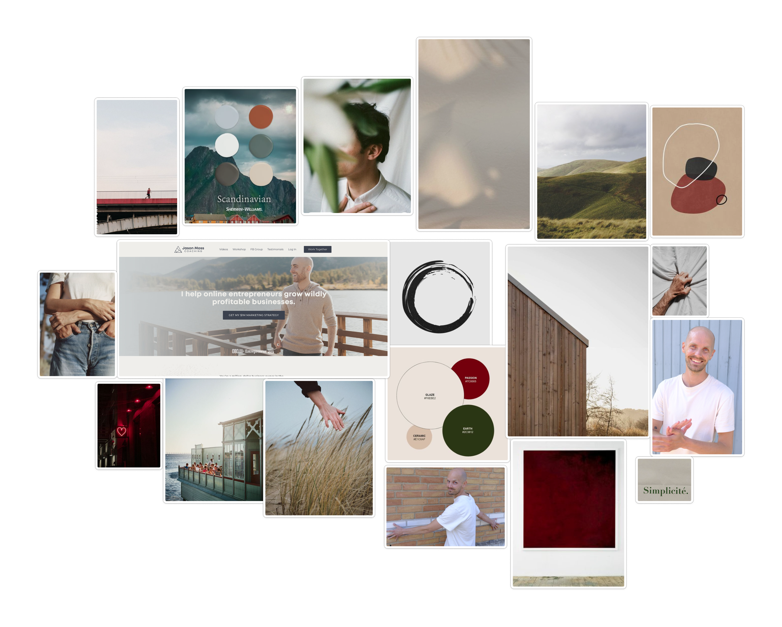
Mood board.
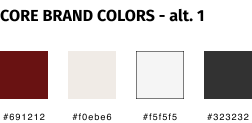
Finding the right colours: An ongoing exploration
Choosing the right color palette for the project proved to be one of the biggest challenges I faced. Niklas and I initially settled on dark red to convey warmth and strength, but as the project evolved and new photography was introduced, the dark red no longer aligned with the images. This led to extensive experimentation, testing different combinations, and even gathering user feedback (by sending out three different options to Niklas’ coaching network) to understand preferences. In the end, we selected beige for its warmth and neutrality (user preference) and charcoal black for contrast and emphasis. This process taught me valuable lessons about iteration, flexibility, and letting the design evolve naturally.
Typography
Fira Sans: Selected for its balance of strength and approachability, aligning with the brand’s mission to support men in navigating relationships. Its geometric structure conveys confidence, while the rounded forms keep it welcoming and modern—avoiding the cold, corporate feel the client wanted to avoid.
Open Sans: Chosen for its excellent readability and neutral tone, making it ideal for body text that communicates information clearly and accessibly.
Graphics
At the client's request to communicate a sense of flow, lightness, and the essence of wind and air through the website, I created custom graphics using Procreate. This included a circle-shaped symbol and a textured background element designed to add subtle depth while keeping the design airy. The graphics evolved naturally as the website took shape.


Typography, different explorations of colour palette and graphics.
Wireframing & Sketches
Exploring different designs
I created sketches and wireframes for key pages (e.g., landing page, contact, about) to define layout and functionality, iterating with Niklas to select the best direction.
Balancing design expertise and client vision
During the design process, I learned the importance of balancing my design knowledge with the client’s vision. Niklas had a clear understanding of what he wanted but looked to me for design expertise. When our perspectives differed, I found it helpful to present three options and explain my preferred choice along with the reasoning behind it. This approach led to thoughtful discussions and stronger outcomes that aligned with both design best practices and the Niklas’s goals. It was a valuable learning experience in communication and collaborative problem-solving.
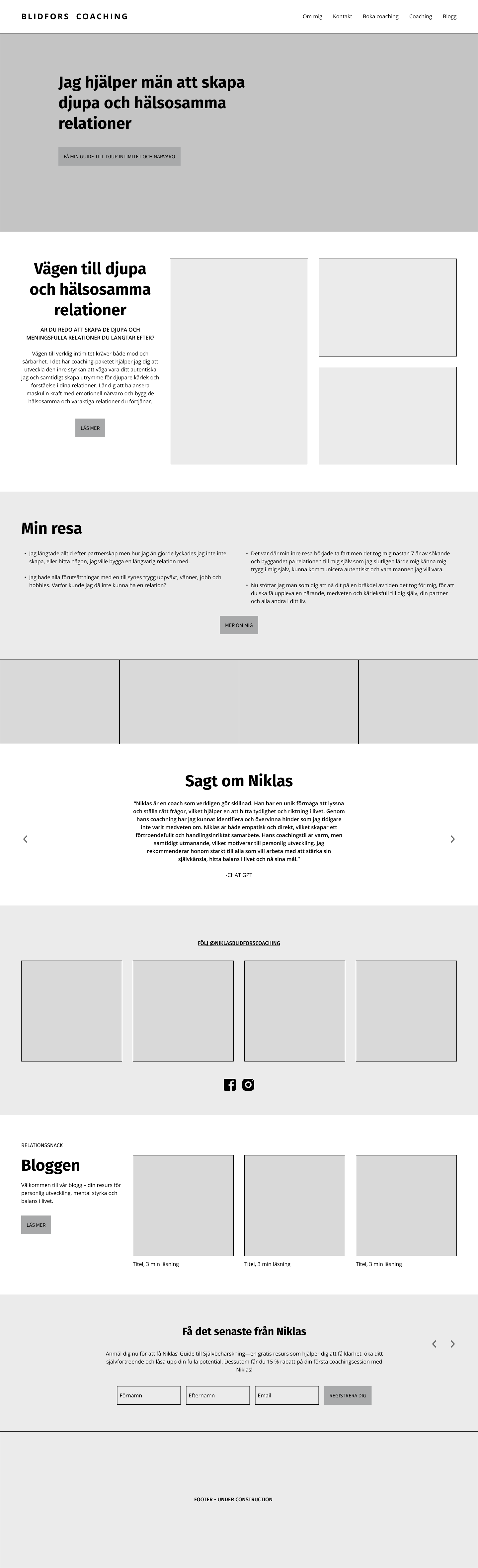

Exploring different designs for the front page.
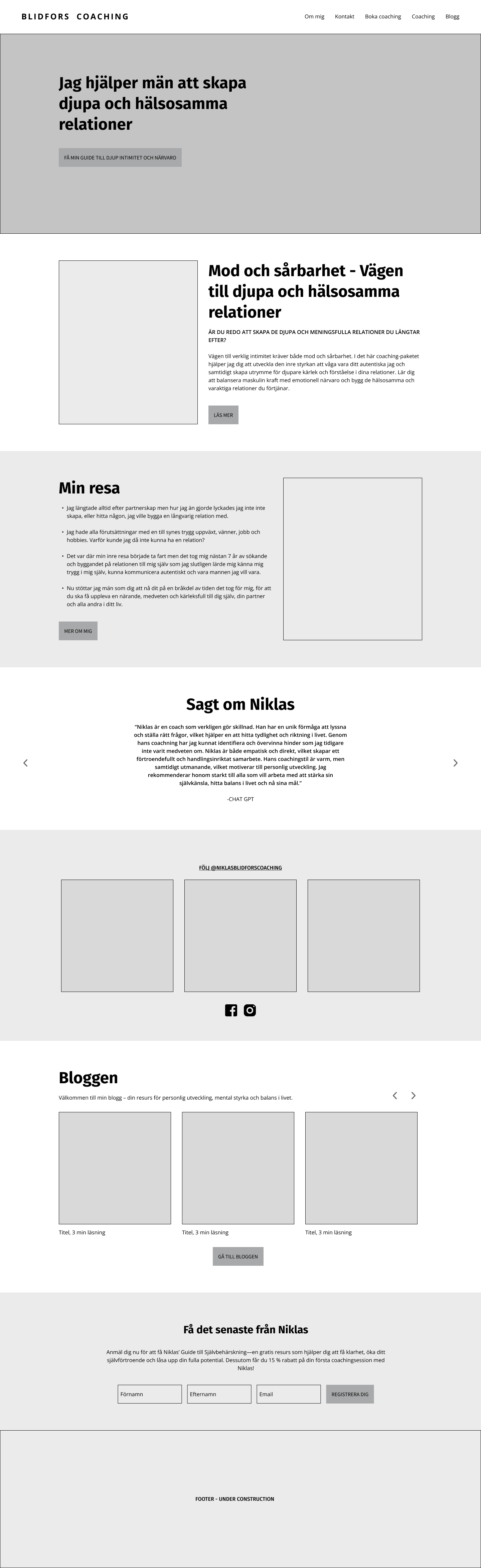
Design Development: Mockups, Refinements, and Integrations
After refining the wireframes, I created high-fidelity mockups, incorporating detailed UI elements to meet both aesthetic and functional requirements. Once the design was good enough, I began building it in Squarespace. As the site took shape, I made numerous tweaks and adjustments based on new ideas and feedback from meetings with Niklas, refining the design throughout the process. Some designs were also adjusted due to the platform's limitations, ensuring the website aligned with Squarespace's capabilities.
Blog Section Removal
During the project, we decided to remove the blog section. Maintaining regular content proved too time-consuming for Niklas, and he concluded it wasn't essential for the launch. We left the option open to add it at a later stage.
Booking Integration
To streamline scheduling, we integrated a booking function using Zcal, a tool for creating customizable scheduling pages. This directs users to an external page where they can easily book a session, enhancing the user experience.


Mock-ups created in Figma worked as a visual communication tool to discuss and refine ideas and designs with Niklas before I built the designs in Squarespace. The designs continued to evolve after these mock-ups were introduced, and some of the final designs look quite different, which reflects the iterative process.
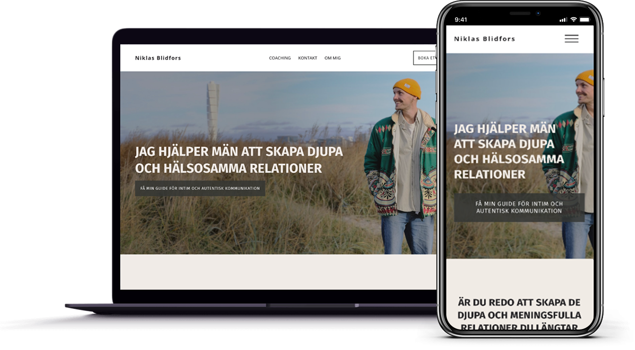
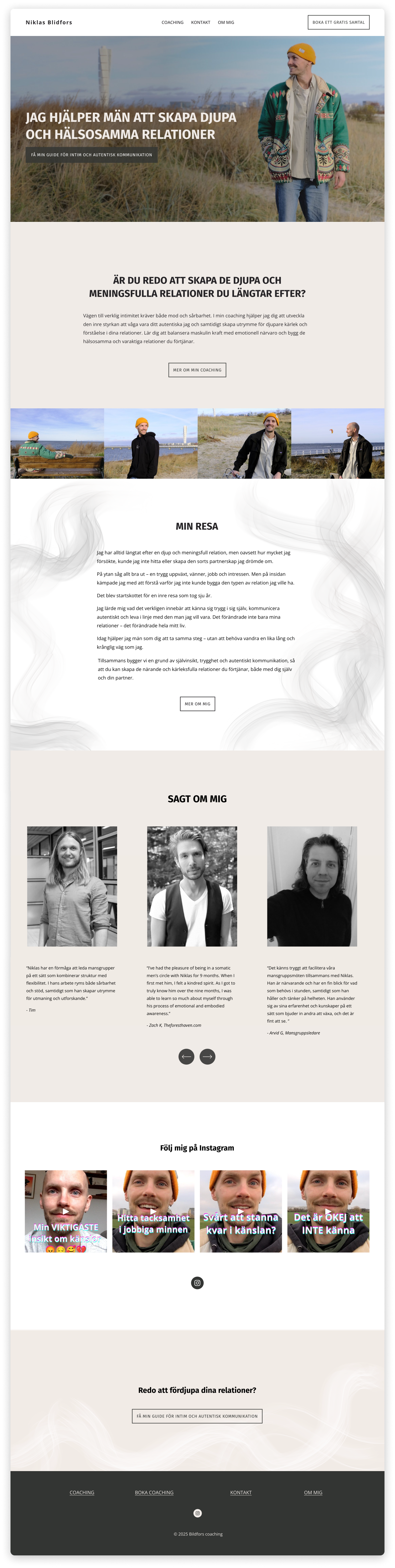
04. Final designs
Desktop designs


Mobile designs


06. Takeaways
Full Ownership of the Design Process
As my first freelance project as a designer, taking complete responsibility for the entire project—from setting up the structure and questionnaires to managing client meetings and presenting designs—was a crucial lesson. Having always worked in teams before, this project required me to take the lead on every aspect and work independently. It pushed me to ensure alignment with the Niklas’ vision while managing all design decisions and logistics on my own.
Early Collaboration on Imagery
I learned the hard way that client imagery should be prioritized before finalizing the color scheme. After Niklas introduced new photos later in the project, the initial brand color clashed with them, which delayed the process. This taught me to ask for imagery earlier and adjust designs accordingly.
Defining Project Scope to Avoid Scope Creep
Creating a project plan early on helped me define the scope and communicate what was and wasn’t included in the scope when needed (which only happened once but was nevertheless really valuable on that occasion). I referred back to the plan regularly to keep the project focused and avoid unnecessary changes, ensuring it stayed within the agreed-upon boundaries.
Learning New Tools (Squarespace & GIMP)
I expanded my skill set by learning Squarespace, a platform I hadn't used before, and GIMP for photo editing. Navigating these new tools was a challenge, but they helped me deliver a polished final product, demonstrating my ability to adapt to new software and handle different aspects of the design process.